PROCESS
For my major project, I chose to create a magazine in the style of an artbook/editorial that features fashion and graphic design elements. I chose this idea because i have enjoyed graphic design projects the most throughout my course, and i feel most comfortable producing a high quality final piece using this method.
I also find a lot of inspiration from physical media, and I wanted to take the chance to showcase my personal aesthetic and art in my professional practice.
I chose four different fashion aesthetics for my magazine, created an outfit for each one from my own wardrobe, and conducted photoshoots to later edit.
My initial idea also included creating short videos that shocases each outfit, that would be edited using different techniques that fit each aesthetic, and feature music that was reworked from existing songs by me. These videos would be connected to QR codes on certain pages of my magazine, creating an interactice and multi-media element.
PROJECT PROPOSAL FORM
file:///C:/Users/Owner/Downloads/Major%20Project%20Proposal%20form%20ejw.pdf
INITIAL IDEAS
I have been planning and brainstorming my major project for almost three years, and as a result, i have been slowly gathering notes and ideas about different page themes, outfits, fonts, effects, etc.
In order to show my ideas, i compiled everything from this initial planning stage into a Miro board, where I organised my collection of notes app ideas into a more digestable format.
TIKTOK TUTORIALS/INSPIRATION COLLECTION
PINTEREST INSPIRATION BOARD
SPOTIFY PLAYLIST
USER PROFILE
AGE: 16-30
GENDER: ALL
ETHNICITY: ALL
LIKES: NOSTALGIA, FUTURISM, INTERNET CULTURE, FASHION, PHYSICAL MEDIA, OLD TECHNOLOGY
DISLIKES: THE COST OF LIVING, AI, CORPORATE MINIMALISM.

My user profile depicts a viewer that shares many of the same traits as me. I personally create art that I would consume, as my art is a reflection of my personality. Therefore, the user that consumes it would mirror that.
As for dislikes, I included AI. This refers to the generative AI that is so damaging to the environment and completely lacks any of the personal depth that true art is fueled by. AI is trained on already existing art made by real humans that may not have given permission for their work to be used in this way, therefore I view generative AI use as unethical and void of true creativity and I hope that my target audience would agree.
PHOTOSHOOTS
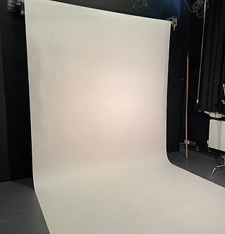
In order to create the images I would need to edit for my magazine, I conducted two photoshoots. Each photoshoot included multiple outfit changes, and props that I gathered that fit with the theme of each look. I rented only a camera, as the lighting provided in the studio was as much as i needed, and I later edited the photo lighting more thoroughly in Adobe Lightroom by utilising camera raw files.
I chose to do it this way as i was not the one taking the photos, so i was not able to control exactly how the images turned out right away.
FONTS
For each aesthetic, I wanted to find fonts that would match the vibe the best. I made sure to use fonts that were 100% free or public domain.
DOGICA
This font is perfect for cybercore as it mimics digital text.
NERDROPOL LATTICE
Futuristic and digital vibe.
ALTE HAAS GROTESK
Versatile and sleek font that is modern and simple.
Arial
Simple font used for main body and office siren aesthetic.
NEUROPOL REGULAR
Similar vibe to Nerdropol.
IMPACT
Bold text perfect for titles.
Magnolia Script
Cute font that is still legible and useful for Kitsch vibe.
The Signature
Handwritten vibe is perfect for Grunge DIY aesthetic.
INSPIRATION IN EXISTING MEDIA
I took inspiration from various sources for this project. Most of my main inspiration came from my own artwork that I have created in my personal time, and I was able to use some assets that were already made by me in my magazine, as well as remaking some elements based on previous projects.


:Desired-reality magazine cover
'Chaos poster' @des1redreal1ty


:Desired-reality ad blocker page
'Spam' video @des1redreal1ty
As for the magazine idea itself, I was inspired by art books and fashion magazines that represented alternative culture.
For example, I am a huge fan of the Japanese fashion magazine called 'FRUiTS'.
This magazine showcases photographs of regular people on the streets of Harajuku who display unique aesthetics and personalities. This magazine was officially discontinued in 2017 after 20 years, with the creator stating 'there are no more cool kids left to photograph'. As a result, the physical issues are incredibly highly sought after and rare.


.jpg)
I have previously used FRUiTS magazine as inspiration in other projects, with it being a main focus of my dissertation and my Critical essay.
CRITICAL ESSAY
file:///C:/Users/Owner/Downloads/Visual%20essay%20EJW.pdf
DISSERTATION
file:///C:/Users/Owner/Downloads/Harajuku%20Fashion_%20How%20the%20political%20and%20cultural%20climate%20of%20Japan%20influences%20subculture.pdf
LOGO AND ASSET CREATION
To create my assets, I wanted to try and make 3D effects without the use of software such as Blender. The reason for this is because I have never been able to create 3D images the way that i want because i struggle to understand such complex programs. So, I decided to try and find an alternative.
I have much more experience in Adobe Illustrator, and there is a feature on the program called '3D and materials' that allows you to turn 2D shapes and text into 3D smart objects. These can then be altered in colour, size, angle, and texture.
I used this method to create multiple stickers and PNGs that I could freely add into my pages, with each one getting a metallic texture, as I like the look of it the most.


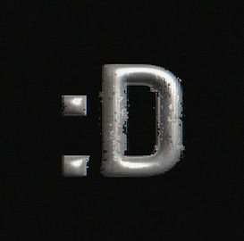
For my logo, I wanted a simple and recognisable one that could easily be drawn or printed. I ended up settling on ':D' as it is the first two characters of ':Desired-reality', and not only fits the cyber vibe that I want to envoke, but it looks like a smiley face emoticon.
I had an idea to create different versions of my logo that fit with each of my chosen aesthetics that could act as filler pages in my magazine, which are important parts of the final piece.
LOGOMOTION
As a teaser that I could post on social media ahead of the graduate showcase, I wanted to make an animated version of my logo. I am a fan of K-Pop, and many groups have a logo that is designed with every new comeback and displayed at the end of music videos and teaser content.
In order to create my own, I exported the Illustrator assets as 'GTLB' files, which preserved the ability to change the angles of the file. Then, I imported it into Adobe After Effects and created a timeline where I changed the rotation to turn 360 degrees over a period of a few seconds. I then looped it a few times to create a spinning logo that still maintains the metallic texture and lighting.



PROCESS IMAGES
.png)
.png)
.png)
.png)
.png)
.png)
.png)
.png)
.png)
.png)
.png)
.png)
.png)
.png)
.png)
.png)
.png)
.png)
TRIAL AND ERROR
It was my first time experimenting with Adobe Indesign, so I initially struggled with the interface. I had to watch tutorials and read articles on how to use the program, and was able to create a simple two-page spread with guides that included a 3mm gutter, which means that there will not be any white space around the edges of each page in a physical print.
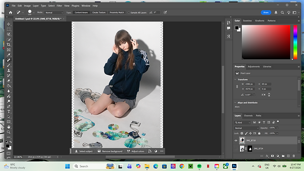
While I intended to create each spread primarily in Indesign, I quickly found that I couldn't get each page to come out exactly how I wanted it to. Therefore, I decided to create the main spread in Photoshop and import it into Indesign where I could then add any extra text and image alterations. This proved to be a lot easier and I was able to execute my vision a lot more efficiently.
.png)
.png)
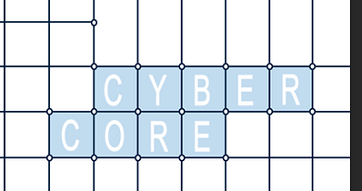
On one of my spreads, I wanted to create this grid effect with text in the squares. My original plan was to create each letter in metallic 3D and then fit them into each square, but once I tried it, I didn't like how it turned out. So, I scrapped that idea and went for a more simple approach, which I think looks a lot cleaner and more legible.
.png)
I also attempted to create the videos that I was planning on reating for each outfit. These were going to be attached to various pages via QR codes. However, I had envisioned them to be comprised of video clips, but I ended up only having still images to work with.
I tried to make the most out of them, creating transparent versions of each image so that I could create layered transition effects, but they weren't turning out as I had hoped.
In the end, I decided to scrap this idea altogether, as I wanted to focus most on the actual magazine spreads, not wanting to cheapen the overall impact of my project with videos that I wasn't completely happy with.
FINAL PIECE AND PHYSICAL MEDIA PLAN
My submission includes the digital PDF file of my magazine, but for the graduate showcase I intend to have physical copies printed to give out to attendees.
I have spent time looking across multiple websites and companies that I could use for the printing, comparing prices and options for the design and texture.
I will most likely be using Mixam UK to print my magazines as I believe they provide the best options for customisation for the same price as other companies.
I would like a model with a soft-touch cover, a thin spine, and 44 pages.
https://drive.google.com/file/d/1hlvaylxxsu6TSs86FjiwzhyKUs8gAdXZ/view?usp=sharing
PDF DIGITAL VERSION

INTERACTIVE FLIPBOOK PDF VERSION

REFLECTION
This project is something that I have been anticipating and visualising for years. It is something that I have had so many ideas about and possibilities that were only limited by my own skills. I have always found graphic design to be the most fun fart of media, and that is no different in my course.
In magazine making, I came to realise in my research that there are lots of rules in their creation. From colour palettes, to layout constraints, to page harmonies and creative limitations. This made me try and rethink my own idea for my magazine, trying to envision a more cohesive layout. However, I wanted my piece to reflect the chaos and overlapping aesthetics that make up my personal style. This is why I did not stick with consistent colour palettes and fonts.
I believe that I managed to navigate Indesign well for a first-time user, and I was able to overcome limitations in order to capture my vision how I wanted it. For example, I made 3D animation without the use of 3D software.
I am dissapointed that I wasn't able to execute my video clips the way I wanted to, and if I had the chance to redo this project I may have added extra focus to this area, but overall I don't think that it lessens the overall impact and the amount of work that I put into the final piece.
I have been told during my time at university that my personal definition of creativity is 'small-minded' as I don't believe that art needs to have a deep meaning, with aesthetic-based art being just as valid, as that's the way I personally like to work. This project was a chance for me to prove this, with my creative liberties visible in the lack of cohesive and conventional magazine elements. This created a hybrid of an editorial and an artbook.
Overall, I am proud of my finished piece, and I will be even prouder when I am able to hold the physical copy in my hands. It is a representation of my personal identity and my inspiration.
- :D